New universe for boundless travel experiences
Panorama Travel is a specialised travelling agency that offers exciting experiences through both culture and nature travels. At design concern we were tasked with creating a visual identity and universe that reflects Panorama Travel’s DNA, both on physical and digital platforms – as well as ensuring people interested in travel finds the website.

design concern
Deliveries.
Panorama Travel
Results.
Visual universe across platforms
Increased competitiveness
Improved website traffic
Increased visibility
Established common communcations line across company
About the project.
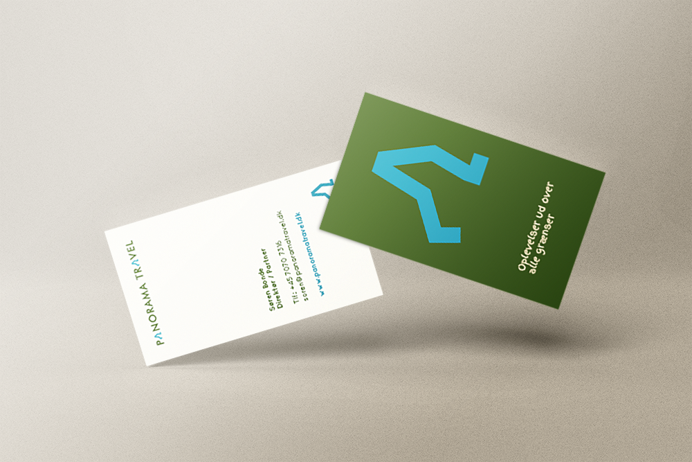
The new visual identity reflects the traveller who is on their way towards new experiences. The logo was therefore designed with a pair of wandering legs that visualises that one is moving both physically and mentally when travelling with Panorama Travel.
The visual universe is expanded on both website and SoMe, on business cards, at trade fairs, on suitcase stickers, T-shirts, and all other places where Panorama Travel is visible.
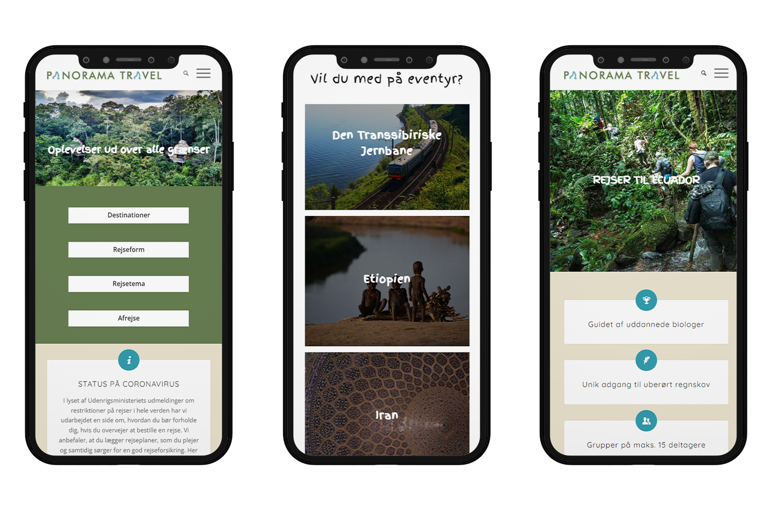
The website is designed and developed so it inspires and guides visitors towards new experiences and travel destinations. It has to be informative, accessible, and user-friendly, but it also has to pique the curiosity and wanderlust in the visitors.
With this in mind, different visual effects and big, beautiful photographs paint a picture about all the exciting travels that are waiting out in the world. The website has also been search engine optimised to strengthen visibility for potential customers. The use of colour in the logo and on the website is based on the colours of nature.
We have thereby created a common direction across the company’s channels which ensures recognisability and credibility with the customer.
The SEO work has further increased the sales for the company.
SEO work on website has given these results
%
Increased number of users
%
Increased user sessions
%
Increased amount of page views
These numbers are compared to the previous period on Google Analytics


